


Creating Dot Plots and Histograms: Year 7 Statistics and Graphing


- Year groups
- Year 7 (Key Stage 3)
- Pages
- 5
- File type
- Preparation
- Print ready


- Subject
- Graphing, Maths
- Topic
- Graphing, Statistics
- Resource types
- Activities
- Preparation
- Print ready
From the author
About this resource
Here's a ready to go activity for students in Year 7 maths class. They will collect numerical data and create their own dot plots and histograms to display their findings! This gives them a sense of ownership over their learning, and it is a great way to assess their skills!
Student Instructions:
Step 1: Think of a question with 6-8 numerical answer options. For example: ‘How many siblings do you have’ could include the answers 0, 1, 2, 3, 4, 5+
‘How long does it take you to get to school’ could include 0-10 mins, 10-20 mins, 20-30 mins, 30-40 mins, 40-50 mins, 50-60 mins, and 1hr+
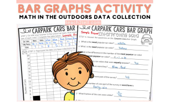
Step 2: Survey at least 20 people. Record each answer with a tally mark in the right column.
Step 3: Turn your data set into a dot plot (using the provided template).
Step 4: Turn your data set into a histogram (using the provided template).
Step 5: Reflect on the process by answering discussion questions and self-assessing your skills.
Grades to Use With:
This activity is designed to target Common Core Year 7 Maths Statistics Standards, but it could also be used for enrichment in Year 6, review in Year 8 or 8, or in secondary school special education classes.
What's Included:
5 Page PDF: Title Page
Survey Data Collection Page
Dot Plot Template
Histogram Template
Reflection and Self-Assessment
Related resources
More resources teachers may find useful
More resources on the same subject and topic.


In the classroom
Teaching tips & learning objectives

Learning objectives
Generate an original statistical survey question with 6-8 numerical answer options.
Collect and tally data from at least 20 survey respondents.
Construct a dot plot from collected data with correctly labelled axes and a title.
Construct a histogram from collected data with correctly labelled axes and a title.
Compare dot plots and histograms and reflect on which chart type is easier to read.

Teaching tips
Review the two worked question examples (number of siblings, commute time) before students design their own, to model a valid 6-8-option numerical question.
Set aside class time or a homework window for the 20-person survey step, since it requires gathering data outside the worksheet itself.
Use the built-in self-assessment rubric as a quick formative check on which of the four project skills need reteaching.

Skills covered
Statistical question design — students write their own survey question with 6-8 numerical answer options, modelled on two worked examples.
Data collection and tallying — students survey at least 20 people and record responses in a tally chart.
Dot plot construction — students plot data points above labelled x-axis categories on a pre-scaled y-axis.
Histogram construction — students shade bars by frequency above labelled x-axis categories on a pre-scaled y-axis.
Self-reflection and self-assessment — students compare chart types and rate their own mastery on a 5-point rubric across 4 skills.
Good to know
Questions teachers ask about this resource
Are the dot plot and histogram grids pre-drawn?
Yes. The templates have a frequency scale from 1 to 11 and blank horizontal-axis boxes. Choose appropriate numerical intervals for the histogram and adapt the frequency scale or use extra graph paper if the data exceed it.

No reviews yet
Downloaded this resource? Tell other teachers how it went.
Resource details
Concepts & topics
Core concepts
 Core concepts
Dot plots
Histograms
Data collection
Statistical questions
Self-assessment
 Topics
Explore more
Categories this resource belongs to
Explore related searches



More to explore