
Pitting two things against each other sounds like a strange thing to do in class. When students compare and contrast two texts, that is essentially what they are doing. You can use anchor charts as a visual aid or reference to help students learn to look at two texts critically to find differences and similarities.
In this post, I discuss what should go into a compare and contrast anchor chart and give you some examples of useful charts. There are resources you can access from Teach Simple. Others are ideas you can adapt to your classroom.
Table of Contents
- The elements of a good compare and contrast anchor chart
- Resources on compare and contrast
- Final thoughts on compare and contrast anchor charts
The elements of a good compare and contrast anchor chart
A good compare and contrast anchor chart should make it absolutely clear what the two ideas mean. This can be something like: ‘compare’ means to look for similarities and ‘contrast’ is to look for what is different.
Any good anchor chart must be set out efficiently and use elements like font, color and shape to organize the content. With a subject like compare and contrast, this is especially important, as the students will be learning to work with two texts separately and then together. The anchor chart can use columns to separate the texts. A different color for each text is also useful, so is using different colors for differences and similarities. Essentially, a good compare and contrast anchor chart should be highly visual.
The chart must make provision for being able to work with specific texts. There are some different approaches you can use to achieve this. The chart could have a blank space at the bottom, where you can fill in information about different texts. Another effective way of doing this is to have two columns on the chart, labelled ‘similarities’ and ‘differences’. The students could fill in the two columns from specific texts. You can also have a grid that features the texts and similarities and differences.
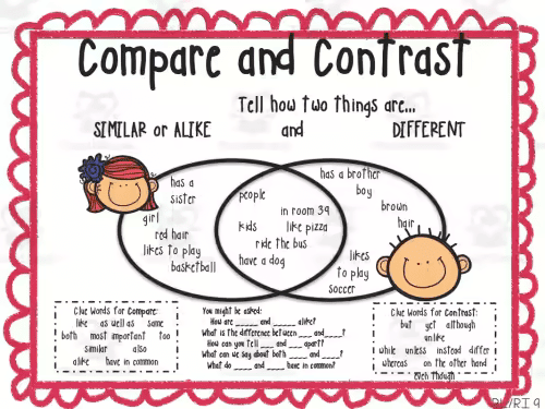
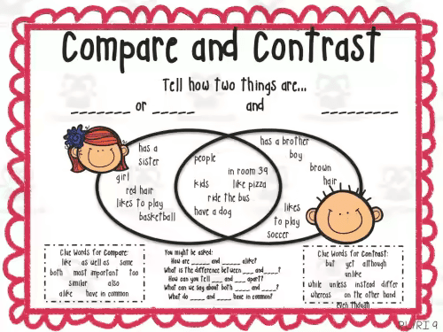
One element that a number of compare and contrast anchor charts features is that of two circles that intersect. Each circle represents a text. The students would fill in the points about each text in the relevant circle. These are the differences between the texts. The intersection between the two circles is the space to fill in the similarities between them.
Resources on compare and contrast
So many of my students don’t understand how to compare and contrast effectively. It’s a natural step from analyzing a text (or other source) and picking out similarities and differences should not be difficult. I’ve selected some resources that will give you ideas to help your students develop this skill.
Compare and Contrast Anchor Chart
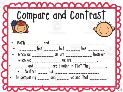
This anchor chart is useful when you are teaching your students to compare and contrast two things. It is aimed at grades 1 – 3. There are four charts in the set that you can display in your classroom. I suggest beginning by working on the charts themselves with the students, so they can be guided to fill them in. This will make sure that they are involved, and invested, in the activities. You can also use the exercises and examples on the charts for ideas for worksheets for the students.
Authors Claim Anchor Chart
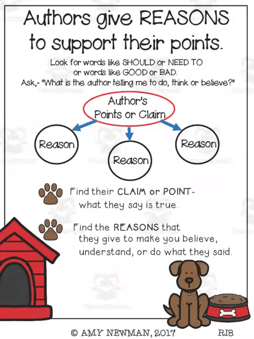
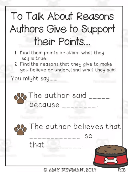
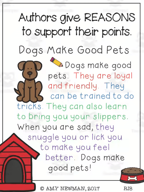
This resource consists of four anchor charts which allow the students to understand how authors give reasons to support their points. They are aimed at grades 1 – 4. The key to the process is for students to find keywords that relate to the claims the author makes. They apply this to two texts, to be able to compare them and also find the contrasts between them. The language in the charts may be a little sophisticated for the lower grades, but you can adapt it and keep the same ideas. This is a valuable resource for beginning the process of analysis, which could be adapted for higher grades as well.
Compare and Contrast Diagram
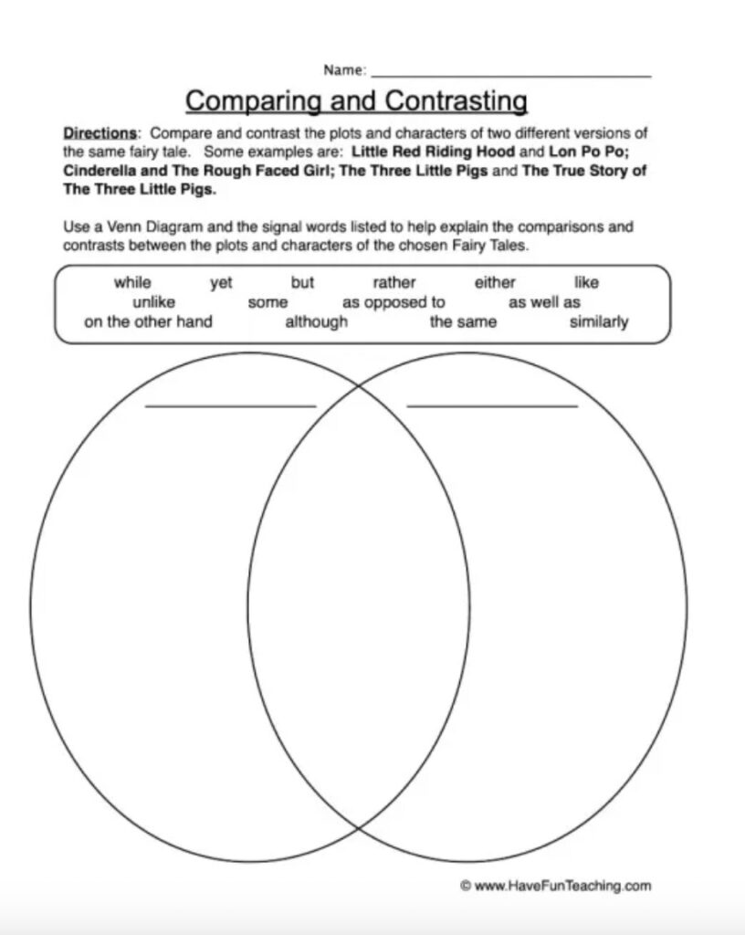
This is a great basic resource for students to use when they are working on comparing and contrasting two texts, or two versions of the same text. The circles with the intersection is the perfect graphic representation of differences and similarities. The chart gives cue words to direct the students in their analysis. It is aimed at grades 2 – 4. By adjusting the topic and the signal words, it can be used to teach any student in any grade the techniques of comparing and contrasting.
Compare & Contrast by Elementary Nest
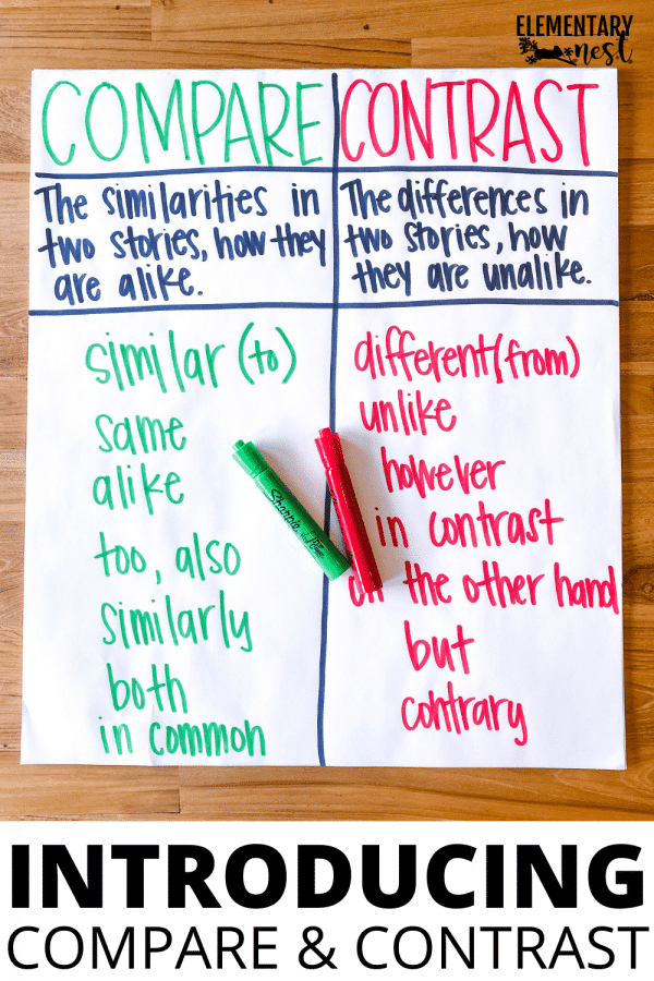
When you look for an anchor chart that will introduce compare and contrast skills, this is a good starting point. The main attraction is its simplicity. The table with two columns brings together the very basics of the process of contrasting and comparing. This is a starting point for younger grades, a revision for middle grades, and the basis of independent work for higher grades.
Compare and Contrast Story elements anchor chart
This resource presents the Compare and Contrast Story Elements. It is quite a busy chart, but the layout and the use of colors and fonts does organize the content quite well. It is the sort of chart you would build up with your students and then display as a reference in the class.
Comparing Characters Graphic Organizer
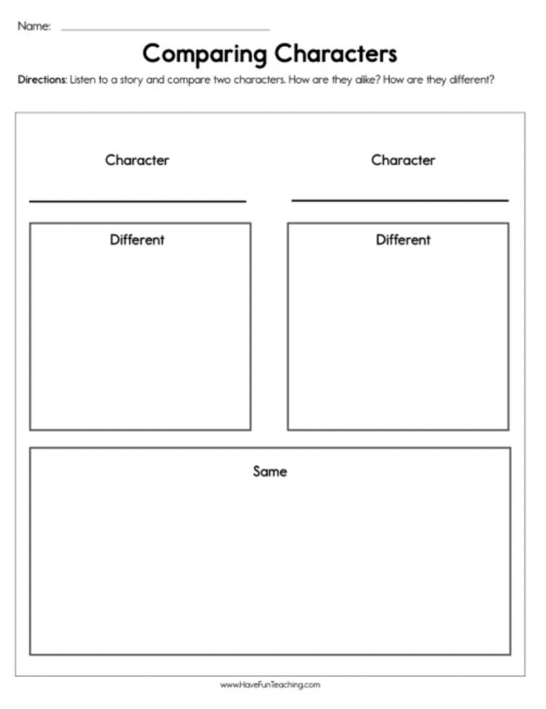
Students may be asked to compare and contrast whole texts, or elements of a text at times. This chart on Comparing Characters is very simple, but an excellent starting point for a focused look at two features of a text. You can adapt it to just about any element of two texts or subjects. I suggest working on filling in the first chart, so that it becomes a true anchor for the students’ individual work on other texts.
Comparing and Contrasting Stories by Grade School Giggles
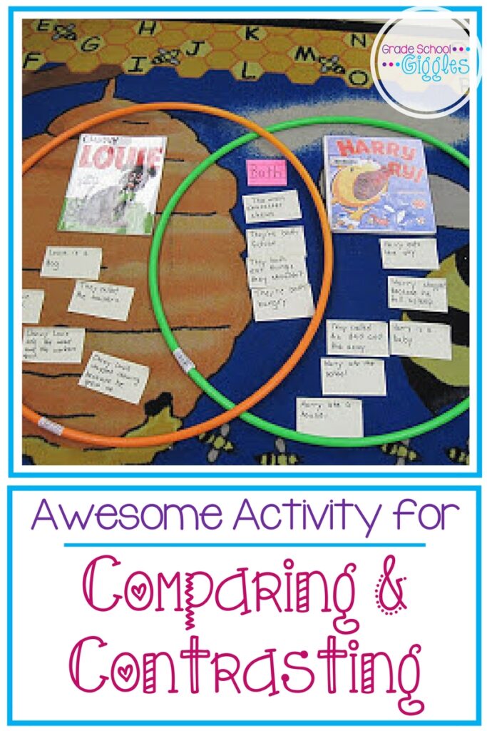
This is a truly interactive and fun activity to teach Comparing and Contrasting. The anchor chart itself is a bright and adaptable base. What really appeals to me, though, is the way you can use sticky notes, or pieces of paper and even the texts themselves in the circles. The two plastic hoops are a lovely touch. The students have to engage with the chart and the activity for it to work. I know this is aimed at lower grades, but just love the idea of higher grades getting ‘down and dirty’ with texts to compare and contrast them.
Compare & Contrast Non Fiction Text Structures by Raise the bar reading
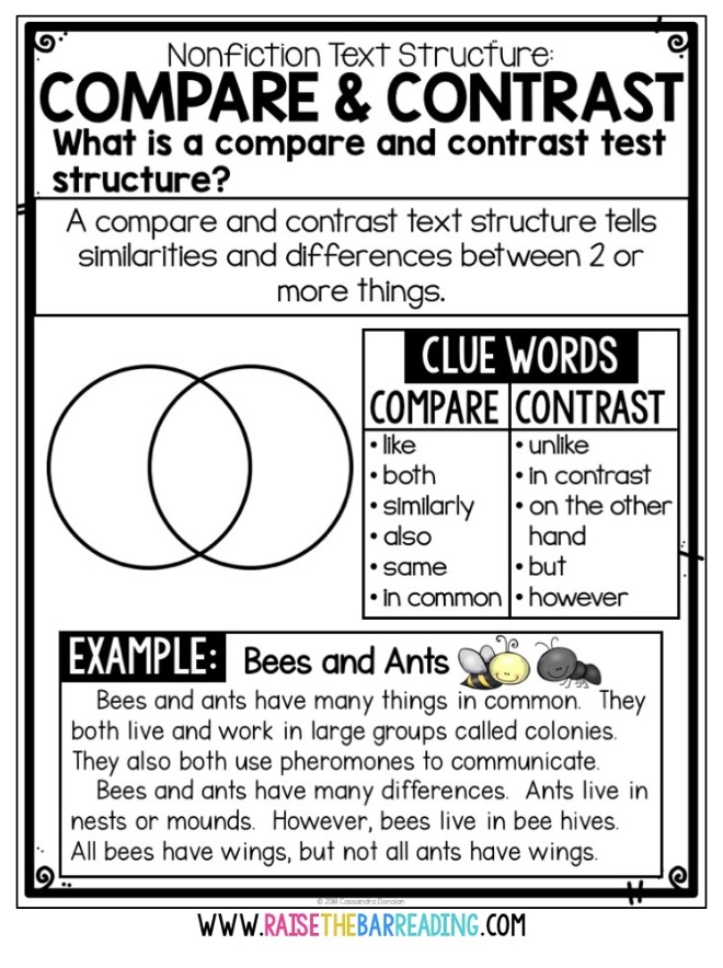
Your students will be tasked to work with different types of texts. This resource is about how to Compare and Contrast non-fiction texts and is a more formal approach to what can be a methodical and precise process. The basic chart will work well as a template for activities with different texts. The bottom half of the chart can be left blank for different texts to be filled in.
Final thoughts on compare and contrast anchor charts
Most students understand the idea of looking for ‘what is the same and what is different’ between two things. They aren’t always able to articulate this as ‘compare and contrast’. Using anchor charts can help them to understand the basic concepts and to apply them more effectively.